
There are two curves in this story and the internet will draw you either one of them, separately, for free.
Type “car depreciation” into a search bar and you get the first curve: a line sloping down, a percentage for the first year, a statistic about driving off the forecourt. Type “compound interest calculator” and you get the second: a line sloping up, seven percent a year, the one every investing site opens with.
Nobody draws them on the same chart. Which is strange, because they are the same money.
So I built the tool that does.
stepstothewealth.com/decay-vs-appreciation/
Educational content only — not financial advice.
One chart, two curves, same axis
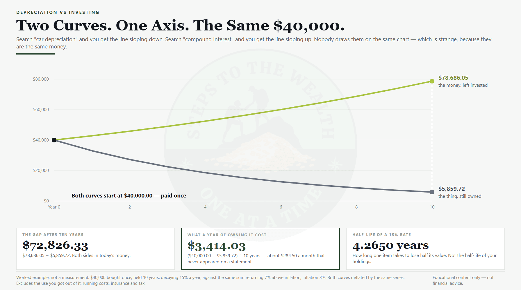
The tool opens on a worked example, because two curves diverging is a shape and a shape is invisible until you draw it. The example is a $40,000 car, bought once, held ten years, losing 15 percent of its value a year, against the same $40,000 left in a market assumed to return 7 percent above inflation, with inflation at 3 percent.
Ten years later:
| What you paid | $40,000.00 |
| What the thing is still worth | $5,859.72 |
| What the money would have been worth | $78,686.05 |
| The gap between them | $72,826.33 |
Both of those figures are in today’s money. I will come back to why that sentence is the most important one on the page.
Two things worth separating out of that table, because they answer different questions.
The $5,859.72 is not the interesting number. Everybody already suspects their car is worth a fraction of what they paid. Nobody is shocked.
The interesting number is $3,414.03. That is what a year of owning that car cost, in the only sense that survives arithmetic: what you paid, minus what you still have, divided by the years you had it. Not the finance payment. Not the insurance. Just the value that quietly left the object while it sat on your drive — about two hundred and eighty dollars a month, for a decade, that never appeared on any statement.
Both sides get deflated, and the naive version flatters the object
Here is the part that made the engine a fork rather than a copy of the one behind my time-value tool, and it is worth being specific about because it runs the opposite way to intuition.
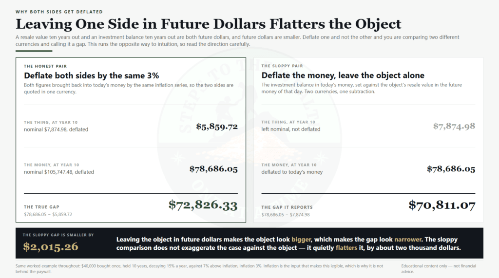
A resale value ten years out is a number in the money of that future day. So is an investment balance. They are both future dollars, and future dollars are smaller. If you deflate one and not the other, you are comparing two different currencies and calling it a gap.
In this example the nominal pair — the numbers as they would appear on that day — are $7,874.98 for the thing and $105,747.48 for the money. Deflate them both by the same 3 percent and you get the $5,859.72 and $78,686.05 above.
Now do it the sloppy way. Take the investment balance in today’s money, $78,686.05, and compare it to the object’s nominal resale value, $7,874.98. That gives $70,811.07.
That is smaller than the true gap. By $2,015.26.
Read that direction carefully, because I had it backwards in my own build notes and had to correct the engine header. Leaving the object nominal makes the object look bigger than it really is, which makes the gap look narrower than it really is. The sloppy comparison does not exaggerate the case against the car. It quietly flatters the car by two thousand dollars.
That is the whole reason both sides are deflated by the same series, and the reason inflation is the one control I refused to put behind the paywall. It is the input that makes this legible. A free tool that was less honest than the paid one would be the wrong way round.
The half-life of a rate
Fifteen percent a year is an abstraction. So the tool converts it into a duration: at that rate, an object takes 4.2650 years to lose half its value.
Four and a quarter years to halve. That is a number you can hold in your head, and it does more work than the percentage ever did.
One precision, and it matters more than it looks. That is the half-life of the rate, not of your holdings. It describes how long one item takes to halve, and it is deliberately independent of how often you buy — the halving time of a 15 percent rate is 4.2650 years whether you bought one car or buy a phone every year.
It is tempting to relabel it “how long until the stuff you own is worth half” and that would be false. If you keep buying, you keep adding new objects at full value while the old ones decay, and the pile settles into a steady ratio that never halves at all. The tool says “half-life of a 15 percent rate” for that reason, and it returns nothing at all when the rate is zero or negative, because a thing that is not losing value does not have a halving time. A blank there is an answer, not a failure.
Negative decay is a legal input
This is where I want to be clear about what the tool is, because a chart with a down-line and an up-line has an obvious rhetorical use and I did not build it for that.
The decay field accepts negative numbers. Anything from -99 to 100. A negative rate means the object gains value. Enter -3 for a house against a 7 percent market and the tool will draw you that comparison without editorialising, and you might not like the answer either way.
The object’s curve is not painted red. It is a muted slate grey, and the accent colour — the chartreuse — belongs to the money line. That was a deliberate design decision: the chart states a gap, it does not moralise about it. The tool models things that appreciate, and if the object wins, the object wins.
There is one honest consequence of that. When the thing gained value, the “cost per year of owning it” comes back empty, because calling it a cost would be a lie.
Nobody knows their own depreciation rate
The 15 percent is the number most often quoted for a new car, which means it is the number most readers arrive already holding. It is not a measurement. This plugin has no resale-value feed and does not pretend to have one, and the form says so in as many words.
Which is a problem, because the whole answer pivots on that rate.
So there is a second route in. Instead of stating a rate, you can state what you think the thing will be worth and at what point — roughly what your car would fetch in five years — and the tool solves for the rate that implies, then shows you which rate it used.
That is not a way of avoiding a number. It is a way of arriving at one from something you actually have an opinion about. Almost nobody can tell you their annual depreciation percentage. Plenty of people can tell you roughly what their car is worth.
How to replace the 15 percent with your own number
The 15 percent is a borrowed number, and a borrowed number is the weakest input in any model. You can replace it with one line of arithmetic, and the tool will run it for you if you would rather not do it by hand.
You need three things you already have: what you paid, what the thing would sell for today, and how long you have owned it. The rate that connects them is 1 − (resale ÷ paid) raised to the power of 1 ÷ years.
Work it through. You paid $40,000. Three years later the honest market quote is $18,500. That is 0.4625 of what you paid, spread across three years, which comes out at 22.67 percent a year — not 15.
If you want to check the arithmetic rather than trust it: at 22.67 percent a year the $40,000 is worth $30,933.61 after one year, $23,922.20 after two, and $18,500.00 after three, which is the quote you started from. That round trip is the test that the rate is right.
The difference is not cosmetic. Run both rates forward to ten years on the same $40,000 and the object lands at $3,060.31 at 22.67 percent against $7,874.98 at 15 percent, both in future dollars before the deflator. Same car, same purchase, one input changed, and the residual more than halves.
That is the whole argument for measuring instead of assuming. A rate that is wrong by seven points does not stay wrong by seven points. It compounds, in the same mechanical way the investment side compounds, and in the opposite direction.
Three honest limits on the number you just produced.
One quote is one data point. A dealer bid, a private-sale asking price and a completed sale are three different numbers, and only the third one is a transaction. If you can find what the same model actually sold for, use that instead.
Real depreciation is front-loaded. Most things lose more in year one than in year five, and a single constant rate flattens that curve. The tool uses a constant rate deliberately, because the alternative is inventing a shape for an asset it has never seen. Read the output as an average across the period, not as a claim about any single year.
And the rate you measured is backward-looking. It tells you what already happened to your asset. It knows nothing about a recall, a battery replacement, or a model refresh that resets the whole used market underneath you.
None of that makes the exercise pointless. It makes it yours. A number you derived from your own asset, with its limits stated, beats a number you inherited from a search result. If you have no quote at all, treat 15 as a placeholder, not a fact.
What you do with it is the part that matters. The rate is not a verdict on the purchase. Plenty of things are worth owning at 22 percent a year — that is what a car is for. The number exists so the cost sits on the page next to the alternative, in the same units, where you can look at both and decide for yourself. That is the entire job of the chart.
If you own several depreciating things, run the largest one first. The arithmetic is identical for all of them, and the biggest ticket usually dominates the total by enough that the rest are a rounding error against it.
A habit is not a purchase
The frequency setting is not decoration. A single purchase decays from its own date. A repeat purchase — every week, every month, every year — builds a pile of objects of different ages, each one decaying from the day it arrived.
Which means a habit and a one-off with the same total spend look nothing alike on the chart, and the recurring one is the case most people are actually living inside.
What the tool refuses to do
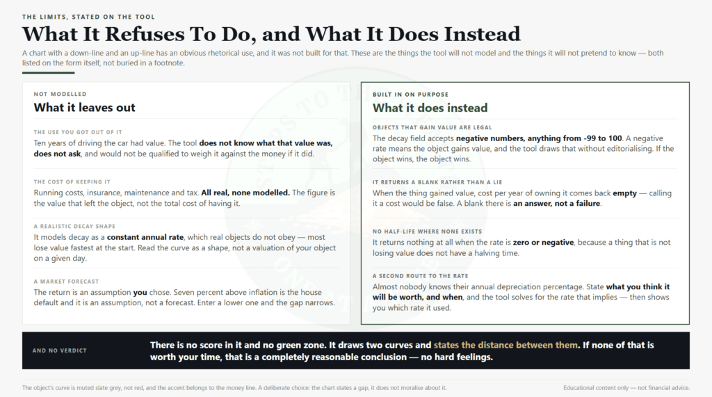
It is not an argument against buying things. It ignores the entire reason anyone buys anything — the use you got out of it. Ten years of driving that car had value. The tool does not know what that value was, does not ask, and would not be qualified to weigh it against the money if it did.
It ignores running costs, insurance, maintenance and tax. All real, none modelled. The figure it gives you is the value that left the object, not the total cost of having it.
It models decay as a constant annual rate, which real objects do not obey. Most lose value fastest at the start. Treat the curve as the shape of the thing rather than a valuation of your specific car on a specific day.
The market return is an assumption you chose. Seven percent above inflation is the house default across these tools and it is an assumption, not a forecast. Enter a lower one and the gap narrows and the tool will not argue with you. No investment returns a fixed rate every year.
For context, US CPI inflation has averaged about 2.5 percent a year over the past twenty years (FRED, CPI-U); the 3 percent used here sits a little above that, and it is one of the controls you can change for free.
And it will not tell you what to do. There is no verdict in it, no score, no green zone. It draws two curves and states the distance between them.
If none of that is worth your time, that is a completely reasonable conclusion. No hard feelings.
Where the free line sits
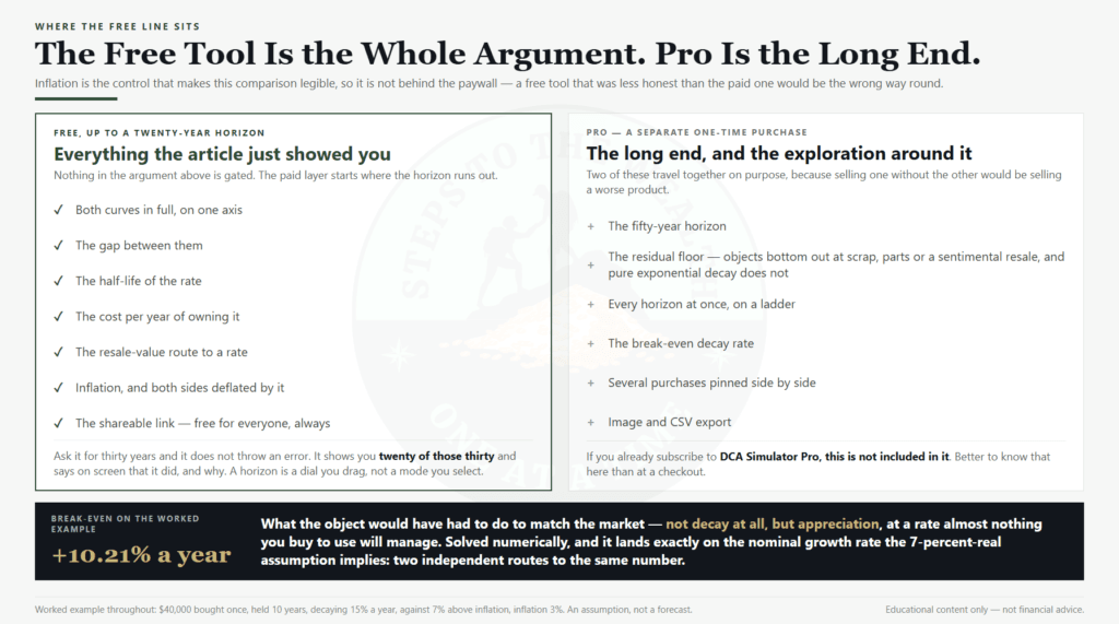
Both curves in full, the gap, the half-life, the cost per year, the resale-value route to a rate, and the shareable link — free, up to a twenty-year horizon.
Ask it for thirty and it does not throw an error at you. It shows you twenty of those thirty years and says on screen that it did, and why. A horizon is a dial you drag, not a mode you select, and a tool that breaks when you drag it too far reads as broken rather than as limited.
The paid layer is the long end and the exploration around it: the fifty-year horizon, the residual floor, every horizon at once on a ladder, the break-even decay rate, several purchases pinned side by side, and image and CSV export.
Two of those travel together for a reason. Pure exponential decay values that $40,000 car at $11.83 after fifty years. That is false — things bottom out at scrap, parts, or a sentimental resale — so the residual floor exists to stop a long horizon printing an absurdity. Selling a fifty-year answer without the floor that makes it honest would be selling a worse product, so the floor and the long horizon are one purchase rather than two.
The sharpest figure in that layer is the break-even decay rate: what the object would have had to do to have matched the market. On this example it comes back at +10.21 percent a year — not decay at all, but appreciation, and appreciation at a rate almost nothing you buy to use will manage.
That figure is also a good check on my own arithmetic. It is solved numerically, by asking the engine repeatedly until the two curves meet, and it lands exactly on the nominal net growth rate the 7-percent-real assumption implies. Two independent routes to the same number.
And the shareable link is free for everyone, always. Pro is a separate one-time purchase — if you already subscribe to DCA Simulator Pro, this is not included in it. Better to know that here than at a checkout.
Pro is $29, paid once — not a subscription and not a bundle. The checkout is here. If the free twenty-year line already answers your question, and for most single purchases it does, you do not need it.
The point
The price of a thing is the number you negotiate, remember, and tell people about. It is also the least interesting number in the transaction, because it is the one number that was never in question.
What you paid is not what you still have. The distance between those two, next to what the same money would have done, is the actual transaction — and until you have seen both curves on one axis, in the same units, you have only ever been shown half of it.
Then decide about the car. That part was always yours.
stepstothewealth.com/decay-vs-appreciation/
Educational content only — not financial advice.