
Type “average retirement savings by age” into a search bar and you will get a number back in about four seconds. You will not get anything to do with it.
That is the whole genre. A table of balances by decade, a chart, sometimes a percentile if the publisher is being generous, and then nothing. The reader arrives with a real question, gets a position in a queue, and leaves knowing exactly one new fact: whether they are above or below some other people.
The question underneath is not “am I ahead”. It is “is this going to work”. Those are different questions and only one of them has an answer worth ten minutes.
The figures behind retirement savings by age come from the Federal Reserve’s Survey of Consumer Finances. What follows is not another table of them. It is what a rank in that table actually funds once you convert it into income.
So I built the tool that answers the first one honestly and then immediately converts it into the second.
stepstothewealth.com/peer-benchmarking/
Educational content only – not financial advice.
The rank, and what the rank funds
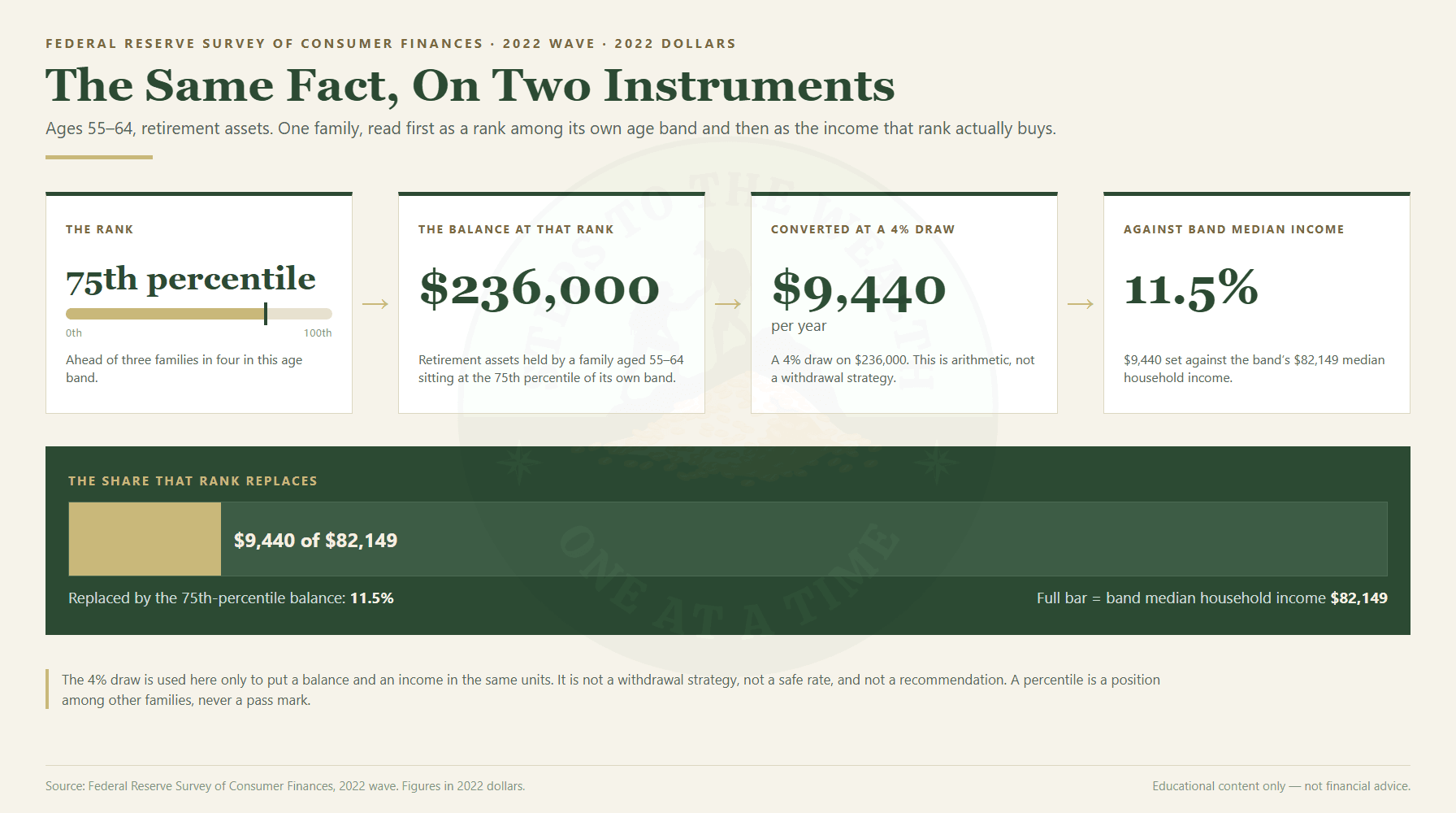
Take a family aged 55 to 64. Retirement assets at the 75th percentile – the bottom of the top quarter, ahead of three out of every four families in that age band.
That is $236,000.
Now convert it. Four percent a year is the most commonly cited draw rate, and I am using it here as a unit converter and nothing else – it turns a stock of assets into an annual flow so the two things can be compared. It is not a withdrawal strategy, I am not recommending it, and the tool does not recommend it either.
Four percent of $236,000 is $9,440 a year.
The median income for that same age band is $82,149. So the top quarter of retirement savers in the last decade before traditional retirement age are holding a balance that replaces 11.5 percent of what their own cohort earns.
Read that pair again, because the two halves of it are usually published by different people.
Seventy-fifth percentile is a good number. It is the number the genre exists to deliver, and if you saw it on its own you would reasonably feel fine about it. Eleven and a half percent is the same number, converted, and it does not feel fine at all.
Neither figure is wrong. They are the same fact, measured on two different instruments, and only one of the instruments measures anything you can spend.
That is the entire thesis of this tool: better than average is not the same as enough. The rank is real, the tool shows it, and I am not going to remove it – it is the most legible thing in the dataset and it is the reason anyone opens the page. But it gets converted on the same screen, immediately, every time.
What the rank is measured against
A percentile is only as meaningful as the group it is drawn from, so it is worth being specific about the group.
The tool ranks you inside a cohort: your age band crossed with your income tercile. The weighted income cuts are $46,479 and $108,091 – below the first is the bottom third, above the second is the top third. Twenty-two cohorts are published: six age-only, sixteen crossed.
That is not the full sixteen you would get from six bands times three terciles, and the missing ones are missing on purpose. Any cell with fewer than 150 families in it is suppressed, not estimated. Two cells fall short in this wave – under-35 in the top income tercile (146 families) and 75-or-older in the middle tercile (129). When you land in one of those, the engine falls back to the age band on its own and tells you on screen that it did, along with how many families the fallback is built on.
I want to be blunt about why that matters. Filling a thin cell by interpolating from its neighbours would produce a number that looks exactly like all the other numbers and carries none of the same evidence. Nobody would ever be able to tell which was which. So it does not happen – the tool either has the cell or says it does not.
One thing the tool deliberately does not rank is income. The cohort is defined partly by your income tercile, so ranking your income inside it would be circular by construction. Income is ranked against the age band only.
The inversion holds in every band
Here is the part that turned this from a calculator into an argument.
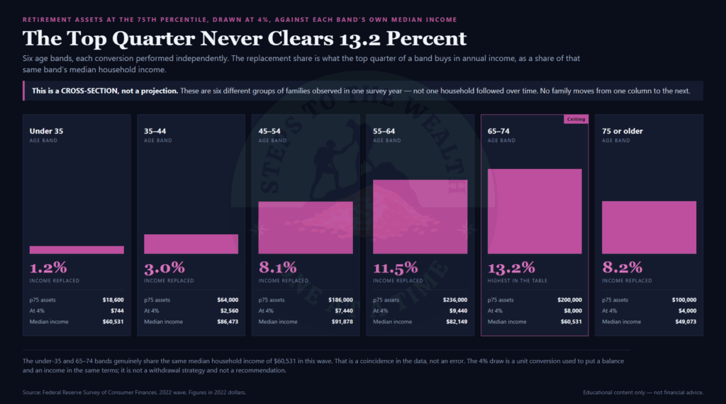
Run that same conversion – the 75th percentile of retirement assets, drawn at four percent, against that band’s own median income – across every age band in the survey:
| Age band | Top quarter starts at | 4% draw | Median income | Replaces |
|---|---|---|---|---|
| Under 35 | $18,600 | $744/yr | $60,531 | 1.2% |
| 35-44 | $64,000 | $2,560/yr | $86,473 | 3.0% |
| 45-54 | $186,000 | $7,440/yr | $91,878 | 8.1% |
| 55-64 | $236,000 | $9,440/yr | $82,149 | 11.5% |
| 65-74 | $200,000 | $8,000/yr | $60,531 | 13.2% |
| 75 or older | $100,000 | $4,000/yr | $49,073 | 8.2% |
The top quarter never gets above 13.2 percent. Not in one band. Not at the peak.
Before anything else about that table: it is a cross-section, not a projection. These are six different groups of families observed in the same survey year. It is a photograph of six rooms, not a film of one person walking between them. Nobody in the 35-44 row is going to “become” the 55-64 row. Reading it as a trajectory is the single easiest mistake to make with this data and it would be my fault for publishing it if I did not say so plainly.
What it does show is that the inversion is not an artifact of the band I opened with. Being in the top quarter of your peers converts into a single-digit or low-teens share of what your peers earn, everywhere, in every band the survey covers. The 55-64 headline is not a cherry-picked row. It is close to the best row there is.
One footnote so nobody thinks it is a copy-paste error: the under-35 band and the 65-74 band genuinely share the same median income of $60,531 in this wave. Two very different groups landing on the same figure is a coincidence in the data, not a bug in the table.
Ten points is not ten points
The other thing a percentile hides is what it costs to move.
Rank feels like a linear scale because it is presented like one. Ten points looks like ten points, the same distance anywhere on the line. In dollars it is nothing of the kind.
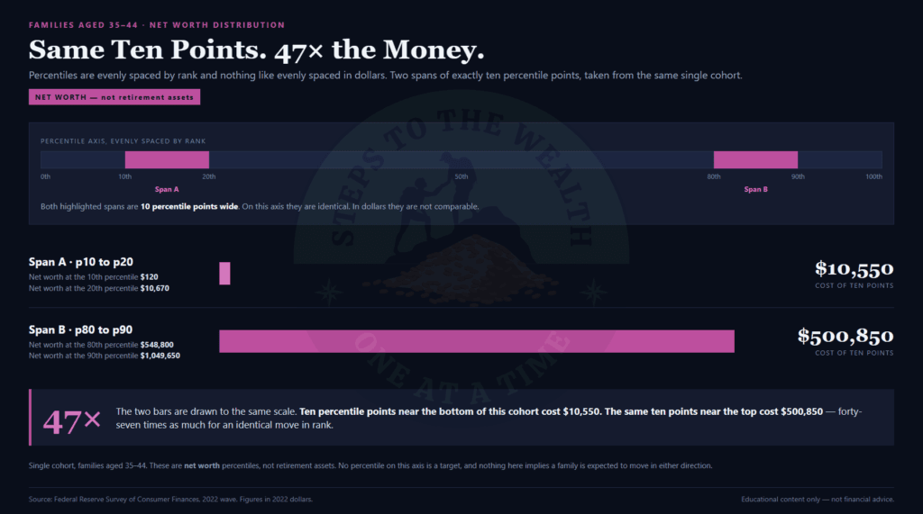
Ages 35 to 44, net worth:
- Moving from the 10th to the 20th percentile costs $10,550. That is $120 to $10,670.
- Moving from the 80th to the 90th costs $500,850. That is $548,800 to $1,049,650.
Same ten points. Forty-seven times the money.
This is why the tool shows the dollar cost of the next ten points rather than just the rank. Not as a target – there is no target in it – but because a rank on its own tells you nothing about whether the gap in front of you is a year of saving or a different life.
It also cuts both ways, and the low end is the more interesting one. At the bottom of that distribution, ten thousand dollars is ten percentile points. A single decision – clearing one balance, holding one buffer – moves a household further up the rank than a decade of grinding will move somebody at the top. That is not a motivational line, it is just where the density is. Most families are packed into a narrow band of dollars, which is exactly why rank is such a volatile and misleading thing to manage.
The mean is not the middle
While we are dismantling instruments: the number the genre usually reports is the average, and the average in this dataset is close to useless.
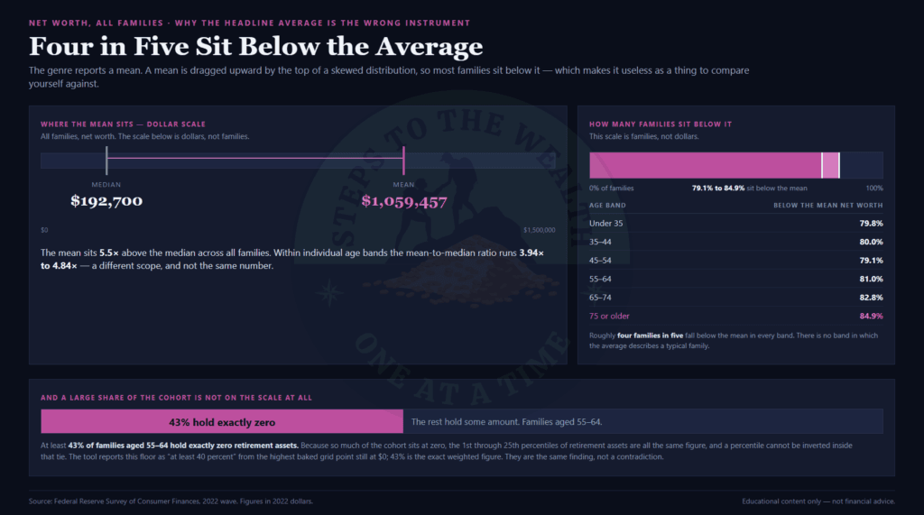
In every age band, between 79.1 percent and 84.9 percent of families sit below the mean net worth. Roughly four in five. The mean is not the middle of anything – it is a figure pulled upward by a small number of very large balances, and it sits well above where most people actually are.
The gap is not subtle. Within age bands the mean runs 3.94 to 4.84 times the median. Across all families it is worse: a mean net worth of $1,059,457 against a median of $192,700 – 5.5 times. If you have ever read an “average American net worth” headline and quietly concluded you were doing badly, that is the arithmetic that did it to you.
And then there is the figure that makes the whole exercise sharper. At least 43 percent of families aged 55 to 64 hold zero retirement assets. Not a small balance. Zero.
The tool phrases this more conservatively than I just did. It says “at least 40 percent”, because it reads that verdict off the highest point on its own baked percentile grid that is still sitting at zero – which is a floor on the true share rather than a measurement of it. Forty-three is the exact weighted figure. Both are correct, and the tool keeps the conservative one because a floor you can prove beats a point estimate you have to defend.
That share is also why the retirement percentile behaves strangely at the bottom. When 43 percent of a cohort holds zero, the 1st through 25th percentiles are all the same number, and a percentile is not invertible inside a tie like that. The tool does not pretend otherwise.
Where the numbers come from, and when they expire
All of it is the Federal Reserve’s Survey of Consumer Finances, 2022 wave – 4,595 families, five imputation implicates, sample-weighted, in 2022 dollars.
That weighting is not a detail. The SCF deliberately oversamples wealthy households, so anyone who loads the raw file and takes a plain median gets $384,500 for median net worth. The true weighted figure is $192,700. The wrong answer is exactly twice the right one and looks completely reasonable, which is the worst property a wrong answer can have.
So the table that ships inside the tool is generated by a script that reproduces the Fed’s own published summary figures first and refuses to write the table at all if any of them is off by three percent or more:
| Figure | This table | Fed published | Difference |
|---|---|---|---|
| Median net worth | $192,700 | $192,900 | -0.10% |
| Mean net worth | $1,059,457 | $1,063,700 | -0.40% |
| Median income | $70,259 | $70,300 | -0.06% |
| Mean income | $141,390 | $141,900 | -0.36% |
Four figures, all inside half a percent. That check runs before the table is written, not after, which means a bad build produces no table rather than a plausible one.
The staleness is real and stated on the page. This is the 2022 wave in 2022 dollars. The 2025 wave publishes around late 2026, and when it does, every figure in this article and in the tool is superseded. The test suite pins the exact numbers quoted here specifically so that a future wave makes the tests fail – which is the point. They are supposed to fail, and the figures are supposed to be restated everywhere, rather than quietly drifting.
Savings is a behaviour, not a rank
One metric in this tool is not a percentile, and it is worth explaining why, because the obvious version of it is a trap.
There is no clean savings-rate variable in the SCF. Take the honest ratio and the median is exactly zero – 48.7 percent of families saved nothing at all in the period – while 3.05 percent exceed 100 percent through windfalls and asset sales. A percentile built on that distribution would be arithmetic dressed as information.
So savings ships as what the survey actually supports: a weighted three-way split. Across all families, 16.3 percent spent more than their income, 27.1 percent broke even, and 56.5 percent spent less. Among 55-64 families specifically it runs 13.8 / 26.6 / 59.6.
Which bucket you are in is a fact. Where you rank inside it is not, and the tool does not invent one.
What the tool refuses to tell you
It will not tell you whether you are on track.
There is no pass mark in it. No “you should have three times your salary by 40”, no green zone, no red zone, no score out of ten. Those thresholds exist in a lot of places and every one of them was chosen by whoever was publishing it. This tool has a survey and a conversion. It does not have an opinion about your life, because it has not met your life.
It will not tell you what to do about the gap. It computes where a set of numbers sits in a distribution and what that position funds at a stated draw rate. What you do next depends on your income, your obligations, your horizon and what you actually want the money for – none of which it asks about, and none of which it would be qualified to weigh if it did.
The four percent is a converter, not a plan. It is there so a balance and an income can be put in the same units. It is not a withdrawal strategy and nothing here endorses one.
It is a snapshot, not a forecast. It cannot tell you what you will hold in twenty years, and the cross-band table above is six groups in one year rather than one household over time.
And it is US data. The SCF surveys American families. If you are somewhere else, the structure of the argument holds and the specific numbers do not.
If none of that is worth your time, that is a completely reasonable conclusion. No hard feelings.
What you can do with it
Enter your age, your household income, your net worth and your retirement assets. The tool resolves your cohort, ranks all three figures inside it, and converts the retirement rank into what it funds at four percent a year against your band’s median income.
That whole reading is free, and it stays free. The percentile, the conversion, the verdict and the shareable link. Not a preview of it – the actual answer. Putting the rank in front of people and charging for the conversion would be selling the setup and withholding the punchline, and the argument only works if both halves arrive together.
The paid layer is the exploration around it: the full decile ladder for your cohort, the cross-band cross-section, and image and CSV export. That layer is described here for completeness and is not on sale yet.
A word on the share link, because this tool handles it differently from every other one I have built. It carries no dollar figures at all. Only your age band, your income tier, and your three ranks rounded to the nearest five points. A recipient’s browser cannot reconstruct anything you entered, so the shared view answers a question about the survey rather than about you.
That is not the same as anonymous, and I am not going to claim it is. The percentile table is public, so a rank inverts back to a range of dollars. The rounding is what keeps it a range instead of a figure. If you export the result as an image, dollars are a per-export opt-in that defaults to off and is never remembered between runs.
The point of all of this is not the rank. The rank is the doorway. The point is the sentence on the other side of it: this position, converted, funds this much per year, against what your own peers earn.
Once you have seen your rank in those units, “am I ahead of average” stops being a question worth asking – and the number you were quietly measuring yourself against stops having any authority over you at all.
The free version gives the whole answer and never clamps it: your percentile on all three measures, the group you were measured against, and the 4% conversion that says what the balance actually funds. That last part is the entire argument of this tool, so it stays free — charging for it would mean selling you the setup and holding back the point. Pro adds the decile ladder, which shows in dollars what each ten points is worth in your group. Pro is $29, paid once — not a subscription and not a bundle. The checkout is here. If knowing where you stand was the question, you do not need it.
stepstothewealth.com/peer-benchmarking/
Educational content only – not financial advice.