
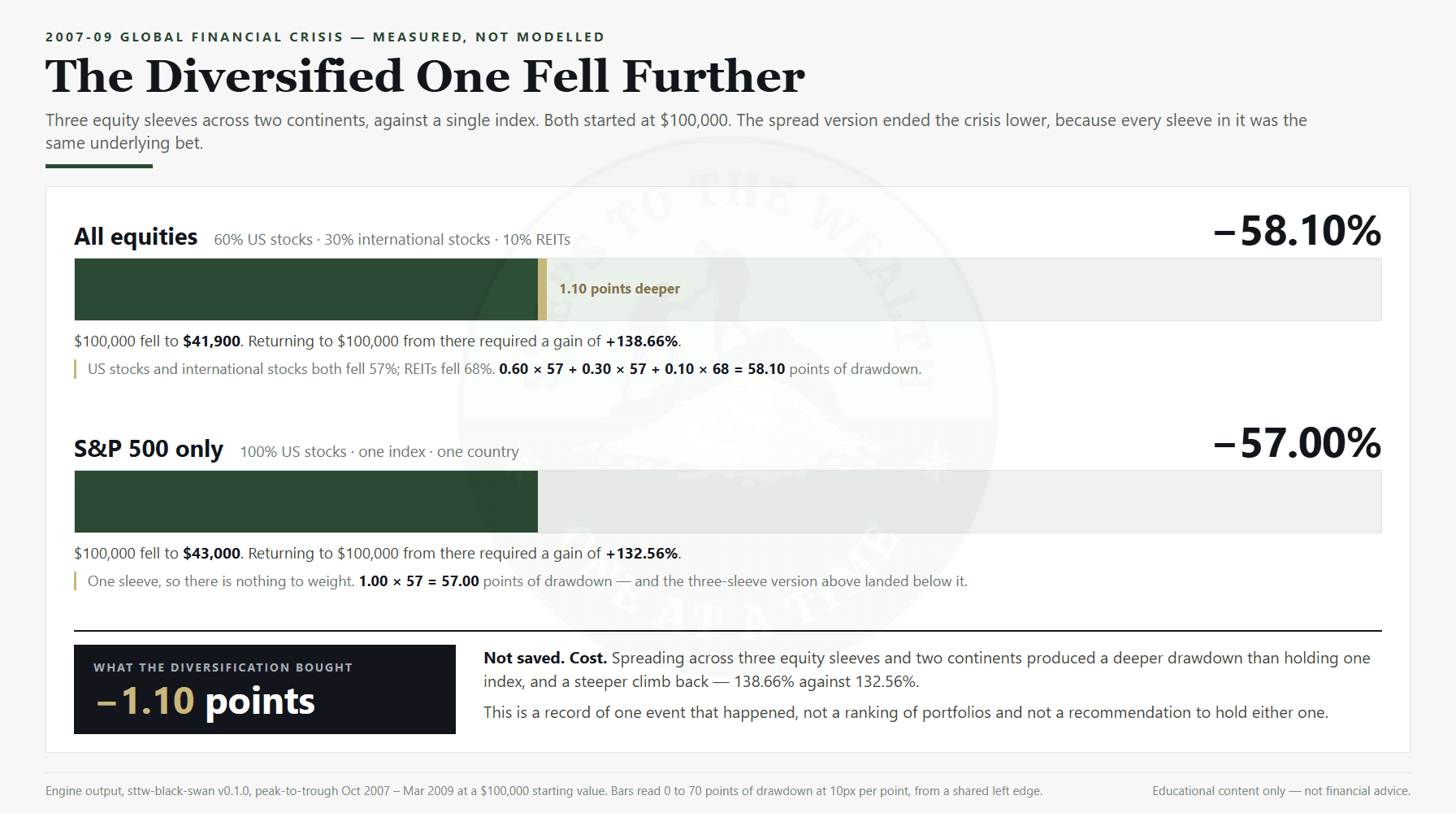
Take the portfolio a lot of careful people hold. Sixty percent US stocks, thirty percent international, ten percent listed real estate. Three sleeves, two continents, two asset types. By every ordinary use of the word, that book is diversified.
Run it through the 2007-09 financial crisis and it fell 58.10 percent.
A portfolio holding nothing but the S&P 500 fell 57.00 percent.
A portfolio stress test borrows its logic from bank stress testing: replay a real historical shock against the thing you actually hold, and read the number it produces. This piece runs that exercise on a portfolio most people would call diversified.
The spread cost 1.1 percentage points of extra loss. Not saved. Cost. On $100,000 that is $58,100 gone against $57,000, and the diversified version needed 138.66 percent to get back to even while the single-index version needed 132.56 percent.
I built a tool that does this to your allocation, and that result is the reason it exists. Not because diversification is useless — it is not, and I will show you exactly where it worked — but because the word has come to mean protection, and in the one crash most people can actually remember, spreading across equities was not protection. It was the same crash wearing three tickers.
The portfolio that got called diversified
That 60/30/10 mix is one of five presets the tool ships. Its label in the tool is honest: All equities. Listed real estate trades like equity, international stocks are equity, and once you say it out loud the result stops being surprising.
The trouble is that almost nobody says it out loud. The mix has three funds, spans developed markets on both sides of an ocean, and adds a fourth asset class by name. It passes every intuitive test for a diversified portfolio, and it went down with the ship.
Here is the same crisis across the tool’s other presets, at $100,000:
| Portfolio | 2008 drawdown | Dollar loss | Gain needed to get back |
|---|---|---|---|
| All equities (60/30/10) | -58.10% | $58,100.00 | +138.66% |
| S&P 500 only | -57.00% | $57,000.00 | +132.56% |
| Three-fund (50/30/20) | -44.60% | $44,600.00 | +80.51% |
| Classic 60/40 | -32.20% | $32,200.00 | +47.49% |
| Four-way split | -7.50% | $7,500.00 | +8.11% |
Read down that column and notice what actually moved the number. It was not the count of funds. It was not the number of countries. It was the share of the book that was not equity. The 60/40 was less diversified by any naive measure — two holdings — and it lost 26 points less than the three-sleeve global mix.
Correlations go to one
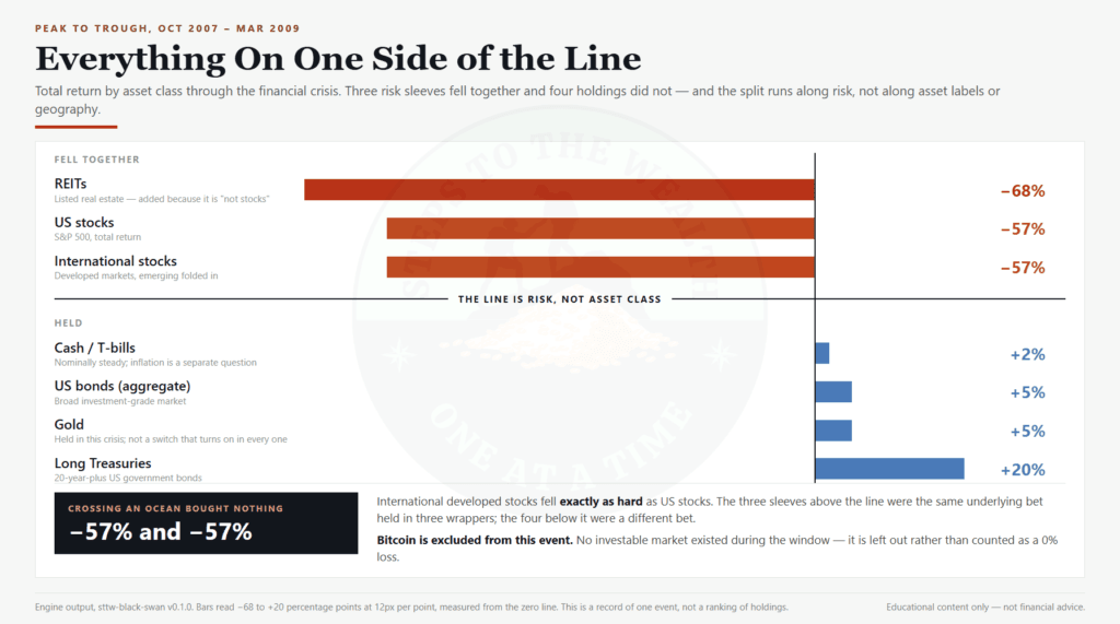
This is the mechanism, and it is the single most useful thing in the dataset. In the 2008 window:
- US stocks: -57%
- International developed: -57%
- REITs: -68%
- US aggregate bonds: +5%
- Long Treasuries: +20%
- Gold: +5%
- Cash: +2%
International stocks fell exactly as hard as US stocks. Crossing an ocean bought nothing. Listed real estate, the sleeve added specifically because it is “not stocks”, fell eleven points harder than stocks did and was the worst holding in the crisis.
Everything that held was on the other side of the line: government bonds, investment-grade bonds, gold, cash. Not because those are good assets, but because in a liquidation the only thing that matters is whether an asset is a risk asset. Risk assets bottom together. That is what a crisis is.
So the useful question about a portfolio is not “how many things do I own.” It is “how much of this is the same bet.” The tool answers the second question by refusing to let equity sleeves net against each other. Each sleeve carries its own peak-to-trough figure, and the weighted result is what it is.
That is the claim this article exists to put arithmetic on. Not that diversification is a bad idea, but that owning more equity sleeves is not the same thing as owning less risk, and only one of those two things is what the word is usually taken to mean.
The number nobody quotes
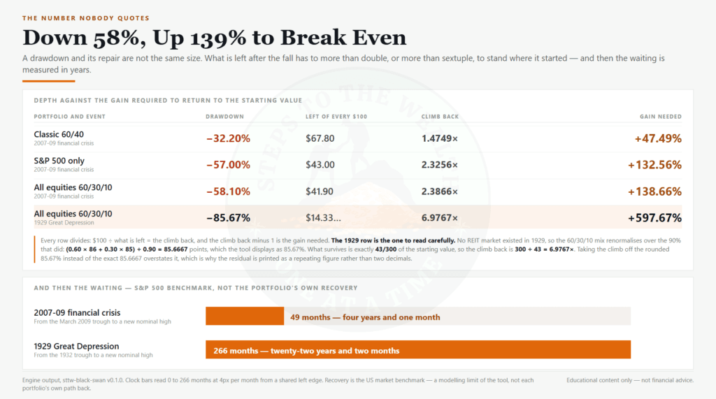
Every drawdown headline stops at the depth. Depth is the less interesting half.
A 58.10 percent loss requires a 138.66 percent gain to get back to where it started. That is not a rhetorical flourish, it is division: you keep 41.9 percent of your money, and 100/41.9 is 2.3866. To break even you have to more than double what is left.
The tool reports that figure next to every drawdown, because the asymmetry is where the real damage lives. And it reports the other half of the cost: time.
After the March 2009 trough, the US market took 49 months to make a new nominal high. Four years and one month of holding an account that was worth less than you put in, with no way to know from inside it that the recovery had started.
The 1929 case is the one that puts the rest in proportion. That same 60/30/10 all-equity mix lost 85.67 percent, needed 597.67 percent to recover, and the market took 266 months to make a new high. Twenty-two years and two months. Anyone who has ever said “I would just hold through it” is making a claim about a twenty-two-year version of themselves.
A note on that figure, because the tool is explicit about it: the recovery clock is the S&P 500 benchmark, not your portfolio’s. A bond-heavy book recovered sooner. It is labelled as the equity benchmark everywhere it appears, and it is not adjusted to flatter anything.
The year the 60/40 broke
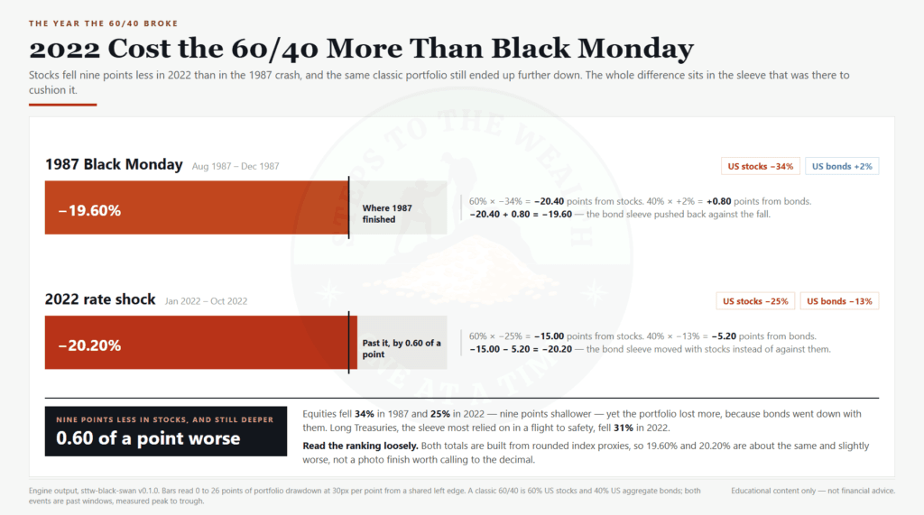
Now the case that undoes the obvious lesson. If the moral so far is “hold bonds”, 2022 is the counterexample, and it is in the same dataset.
The classic 60/40 in the 2022 rate shock: -20.20%.
The classic 60/40 in the 1987 Black Monday crash: -19.60%.
The 60/40 lost slightly more in 2022 than it did in Black Monday. In 1987 US stocks fell 34 percent. In 2022 they fell 25 percent — nine points less. The difference is entirely the bond sleeve. In 1987 aggregate bonds gained 2 percent and cushioned the equity loss. In 2022 they fell 13 percent, their worst year since 1976, at the same time as stocks. Long Treasuries fell 31 percent, harder than stocks did.
Both those numbers are drawn from rounded index proxies, so treat the ranking as “about the same, and slightly worse” rather than a photo finish. The point survives either way: a nine-point smaller equity fall produced a slightly larger portfolio loss, because the hedge stopped hedging.
That is what the 60/40 breaking means. Not that bonds are bad. That the correlation which makes the 60/40 work is a historical tendency and not a law, and in 2022 it went the other way.
Nothing is a hedge every time
The same pattern holds for every asset sold as protection, and the dataset carries all of it.
Gold. Roughly doubled through the 1973-74 stagflation, when it was the sleeve that carried the whole portfolio. Then crashed 45 percent through 1980-82 from its January 1980 peak. And in 2022, the year of eight percent inflation, when gold was supposed to be the inflation hedge: flat.
Bitcoin. In the 2020 COVID crash it fell 50 percent, harder than stocks, at the same time as stocks. Across 2022 it fell 65 percent in the window. On the two occasions it has traded through a broad crisis, it behaved like the highest-beta risk asset in the book, which is what it is. The Crypto tilt preset — 55 percent US stocks, 25 percent bonds, 20 percent bitcoin — fell 28.70 percent in COVID against the 60/40’s 20.40 percent, and 30.00 percent in 2022 against the 60/40’s 20.20 percent.
The defensive book. The Four-way split (25 percent each US stocks, long Treasuries, gold, cash) is the star of the 2008 table at -7.50 percent. It also gained value through 1973-74, ending the window at $113,500 on a $100,000 start, and gained through the dot-com bust. Then look at 1980-82: -14.25 percent, driven by the gold sleeve losing 45 percent. And in 1929 the same book lost 23.67 percent with a quarter of it excluded from the calculation entirely, because gold was pegged at $20.67 an ounce under the gold standard and was not a freely priced hedge at all.
There is no sleeve in this dataset that worked in every crisis. The last crisis’s winner was frequently the next one’s worst holding. That is the whole finding, and it is why the tool does not recommend an allocation. It reports what happened to the one you typed in.
What the portfolio stress test refuses to tell you
The Crypto tilt result above hides a design decision worth explaining, because it is where most backtests quietly lie.
Run that 20-percent-bitcoin portfolio against 2008 and the tool does not give you a number for the bitcoin sleeve. There was no investable bitcoin market in 2008. So the sleeve is excluded, the remaining 80 percent is renormalised, and the result is reported as a drawdown on the part of your book that has data, with a note saying which sleeve was dropped and why.
The tempting shortcut is to treat a missing asset as zero percent return. Do that and a 20-percent crypto position appears to cushion the 2008 crash, because a fifth of the portfolio sat there politely doing nothing while everything else burned. That is a fabricated hedge, and it is the single easiest way to make a backtest flatter a portfolio.
Same rule everywhere: REITs are excluded before 1972, gold in 1929, bitcoin before 2020. You cannot backtest crypto through the Depression. The tool says so rather than inventing a cell.
Did buying through it help
The second readout answers the question that actually matters to anyone still contributing: if I had kept buying every month through the crash, what happened?
Through the 2007-09 window and out to the new high — 17 months down, 49 months back, 66 months in total — contributing $500 a month meant $33,000 contributed and an ending value of $48,869.72, a gain of 48.09 percent. The average purchase price landed at 0.6753 of the pre-crash level. Steady buying through the down-leg bought at an average of about 68 cents on the pre-crash dollar.
Two honest caveats, both stated in the tool.
The path is stylised: a straight line from peak to trough over the historical down-months, then a straight line back to the prior peak over the historical recovery months. Real markets do not move in straight lines, and I do not have per-month index series for nine events, so I am not going to pretend to. If you want a contribution readout built on real historical price series rather than a stylised path, that is what the DCA Simulator is for.
And the lump-sum comparison is definitional, not a finding. A lump invested at the peak ends the window worth exactly what it cost, because the path by construction returns to the level it started from. So the honest claim here is narrow and it is only about average cost: buying through a decline lowers the average price you paid. It is not a return prediction and it is not a strategy recommendation.
The 1929 version of the same readout is the useful reality check. $500 a month through that event runs 299 months — just under twenty-five years — and turns $149,500 into $341,844.44. Arithmetically encouraging. Practically, it is a claim about a quarter of a century of unbroken discipline through the Great Depression, and the number should be read as the boundary of what “just keep buying” means rather than as reassurance.
What to do with the number
A drawdown figure is worth nothing on its own. It becomes useful only if it changes something before the next crisis, while you are calm and the number is still abstract. The portfolio stress test produces one sentence worth keeping: a portfolio like mine fell this far, and the market took this long to come back. Everything after that is a decision about whether you can live with that sentence.
There are three honest responses to it. You accept the number, which means committing now to do nothing when it arrives. You reduce it, which means moving weight out of risk assets and accepting a lower expected return in every year that is not a crisis — that trade is real and it is permanent, not a free hedge. Or you shorten the clock, which usually means holding enough outside the portfolio that you are never a forced seller during the 49 months.
What you cannot do is pick the response afterwards. The one thing nine events agree on is that the decision gets made under conditions where nobody decides well: the number is on the screen, the recovery date is unknown, and every headline explains why this time is structurally different. Choosing in advance, in writing, is the only version of that decision you get to make while thinking clearly. It is also the only part of this that is free.
It replays, it does not forecast
The one rule this tool is built around: every figure in it is peak-to-trough history from an event that actually happened. There is no projection anywhere in it. It does not put a probability on a crash, it does not say what happens next, and it has no opinion about the current market. The question it answers is narrow and past tense: a portfolio like yours fell this far in an event that already happened, and the market took this long to come back. Could you have held?
That is deliberately a smaller claim than most tools make, and it is the only claim the data supports.
What it is not: nine events is nine events, not a distribution. The drawdowns are weighted peak-to-trough figures that assume the sleeves bottomed together, which slightly overstates the loss — the safe direction for a risk tool, and disclosed. The figures are rounded index proxies in USD with no fees, tax or slippage. The recovery months are the S&P benchmark, not yours. And the older non-equity cells are the lower-confidence figures in the set, labelled as such in the source catalogue.
Running it is free. Three headline crashes — the 2007-09 financial crisis, the 2020 COVID crash and the 2000-02 dot-com bust — along with the full drawdown, the dollar loss, the gain needed to recover, the recovery clock and the DCA readout. No account. The shareable result link is free too, and always will be, because a risk tool nobody can send to anyone is a risk tool nobody uses.
The paid tier widens the library rather than unlocking the basics: all nine events back to 1929, two portfolios side by side, a custom-crash builder for your own drawdown assumptions, and image and CSV export. Pro is $29, paid once — not a subscription and not a bundle. The checkout is here. If the three free crashes already told you what you needed about this mix, you do not need it.
Run your allocation through it here: Portfolio Stress Test
Use your real weights, not the ones you mean to move to. The output is only as honest as the mix you type in, and the point of the exercise is not to find out that you are fine. It is to find out what number you would have been looking at, so that if you ever see it again you have seen it before.
Educational content only — not financial advice.