
Most investors evaluate a strategy with exactly one number: what it returned. That is like judging a car on top speed and never asking about the brakes.
The standard fix is a risk-adjusted measure, and the best known of those is the Sharpe ratio. It appears on fund factsheets, broker dashboards, backtest reports and portfolio trackers, usually as a single decimal with no working shown.
Here is the Sharpe ratio explained properly — what it measures, and the three specific ways the number printed on your screen commonly stops being a Sharpe ratio at all while still being labelled as one.
Sharpe Ratio Explained in One Sentence
The Sharpe ratio asks how much extra return a strategy produced for each unit of volatility it made you endure.
That is the whole idea. A strategy that returns 8% with mild movement is doing something different from a strategy that returns 8% with violent movement, and the return number alone cannot tell them apart. The ratio makes the comparison explicit by dividing one by the other.
The formula has three inputs:
- The return the strategy produced, annualised.
- The risk-free rate, subtracted from that return. This is what you could have earned without taking risk at all, so it is the hurdle the strategy has to clear before anything counts as skill.
- The volatility of the returns, annualised, as the denominator.
Written out: (return − risk-free rate) ÷ volatility. The numerator is what you actually gained by taking risk. The denominator is how much turbulence you absorbed to get it.
Same Return, Different Answer
The reason the ratio exists is that two strategies can post identical returns and be nothing alike.
Take two plans that both returned 8% a year against a 4% risk-free rate. The first had 10% volatility, the second had 20%. Both numerators are the same: 8 minus 4 is 4. The first plan scores 4 divided by 10, which is 0.40. The second scores 4 divided by 20, which is 0.20.
Identical returns, and one delivered them at half the cost in turbulence. If you were choosing between them on the return column alone, you would have called it a tie. That is the gap the Sharpe ratio was invented to close, and when it is calculated correctly it closes it well.
Three Ways the Number Stops Being a Sharpe Ratio
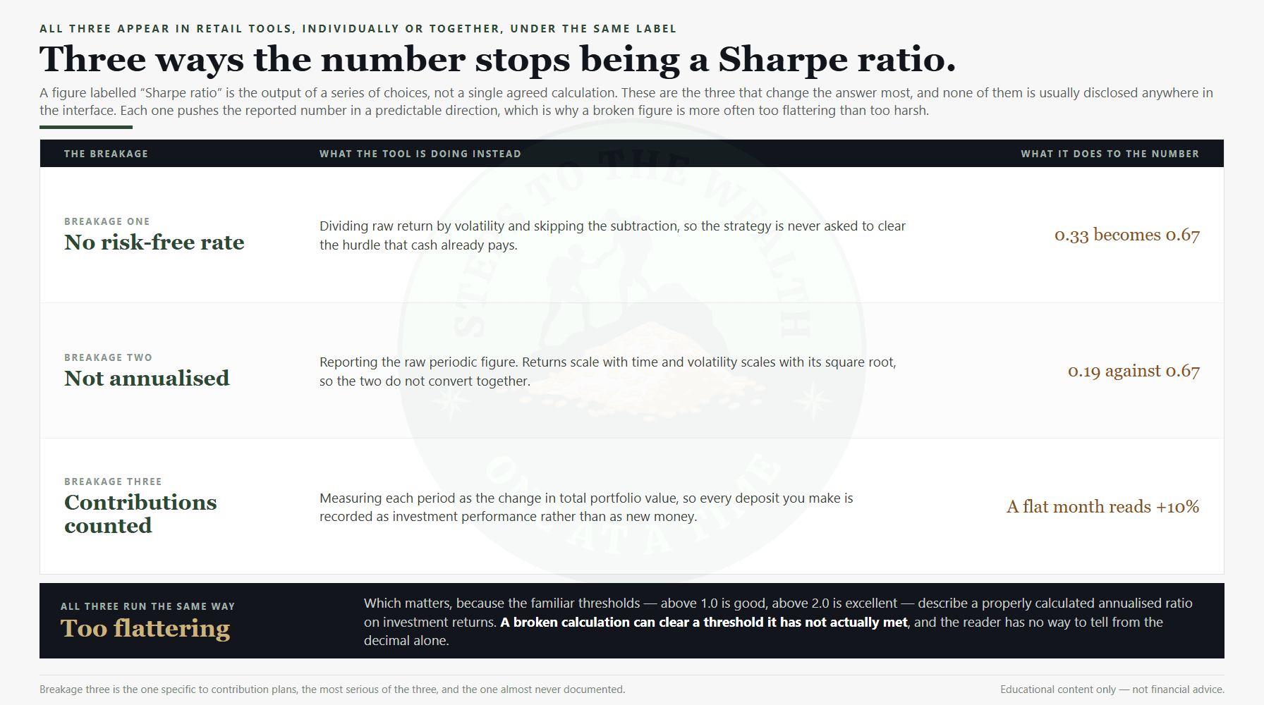
Now the part that matters in practice. Retail tools very often print something called a Sharpe ratio that is not one. There are three common breakages, and they can appear individually or all at once.
Breakage One: The Risk-Free Rate Is Left Out
The most frequent shortcut is to divide return straight by volatility and skip subtracting the risk-free rate entirely.
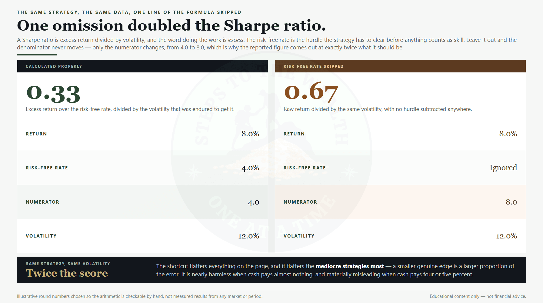
Watch what that does. A strategy returns 8% with 12% volatility, and the risk-free rate is 4%. Calculated properly the numerator is 4, and the ratio is 4 divided by 12, or 0.33. Skip the subtraction and the numerator becomes 8, so the ratio is 8 divided by 12, or 0.67.
The denominator never moved. The numerator went from 4 to 8, so the reported figure is exactly twice what it should be, purely from an omission. Nothing about the strategy changed.
This matters most when the risk-free rate is high. In a period where cash pays close to nothing, the shortcut is nearly harmless. In a period where cash pays 4% or 5%, it flatters every strategy on the page, and it flatters the mediocre ones most, because a smaller genuine edge is a larger proportion of the error.
Breakage Two: The Numbers Are Not Annualised
A Sharpe ratio is conventionally an annual figure. Tools that compute from monthly, weekly or per-transaction data sometimes report the raw periodic ratio without converting it.
The conversion is not symmetrical, which is what makes this easy to get wrong. Returns scale with time, so a monthly return is multiplied by 12. Volatility scales with the square root of time, so a monthly volatility is multiplied by the square root of 12, roughly 3.46.
Run it through. A plan averaging 0.6667% a month with 3.4641% monthly volatility has a monthly ratio of about 0.19. Annualise it — the return becomes 8%, the volatility becomes 12% — and the ratio is about 0.67. Same plan, same data, and the unconverted figure looks dramatically worse.
The practical damage is comparison. A periodic ratio and an annual ratio are different units, and putting them side by side is the same category of error as comparing a monthly bill to an annual salary.
Breakage Three: Contributions Get Counted as Return
This one is specific to contribution plans, it is the most serious, and it is almost never disclosed.
If a tool measures each period’s return as the change in total portfolio value divided by the previous value, then every deposit you make is recorded as performance.
The arithmetic is stark. Your portfolio is worth $5,000. You contribute $500. The market does absolutely nothing that month, so the portfolio is worth $5,500. Measured that way, the period return is 500 divided by 5,000, which is 10%. Your true investment return for the month was 0%.
For a lump sum that never receives another deposit, this problem does not exist. For a monthly DCA plan it is pervasive, and it does not average out — it biases the average return upward in every single period where a contribution lands. The resulting ratio is substantially a measurement of your contribution schedule wearing the name of a risk metric.
It also interacts badly with the other two. A tool that skips the risk-free rate and counts contributions as return will report a confident-looking number that has almost no relationship to how the investments performed.
When the Ratio Goes Negative It Inverts
There is a structural flaw worth knowing about, because it shows up exactly when you are most likely to be checking.
When a strategy returns less than the risk-free rate, the numerator turns negative, and dividing a negative number by a larger denominator makes it less negative. More volatility improves the score.
Two plans both returned 2% against a 4% risk-free rate, so both numerators are minus 2. The plan with 10% volatility scores minus 2 divided by 10, which is −0.20. The plan with 20% volatility scores minus 2 divided by 20, which is −0.10.
The second plan is twice as turbulent for the same disappointing return, and it ranks higher. This is not a rounding artefact or a quirk of these numbers; it is what the formula does whenever the numerator is below zero. The ordering is simply not meaningful in that region.
The practical rule is short: if the ratio is negative, stop reading it as a ranking. It is telling you the strategy failed to beat cash, which is the entire signal available. Comparing two negative ratios to each other is comparing artefacts.
What the Familiar Thresholds Actually Mean
You will see rules of thumb attached to these numbers: above 1.0 is good, above 2.0 is excellent, above 3.0 is exceptional.
Those thresholds refer to a properly calculated, annualised Sharpe ratio on investment returns. Applied to any of the three broken versions above, they are meaningless — and worse than meaningless, because a broken calculation tends to run high, so a plan can clear a threshold it has not actually met.
Before you compare your number to any threshold, the honest question is whether the number is the thing the threshold describes. If the tool does not document its formula, treat the figure as a relative indicator inside that tool only, and never as a cross-tool comparison.
The Assumption Underneath the Formula
William Sharpe introduced the measure in 1966, and like every summary statistic it buys its simplicity with an assumption.
Standard deviation is a good description of scatter when returns are distributed roughly symmetrically around their average. It is a poor description when they are not. Some return streams are mostly small gains punctuated by rare severe losses, and a measure built on standard deviation will read that calm stretch as low risk right up until the rare event arrives.
This is why the ratio can flatter exactly the strategies that deserve the most scrutiny. Anything that earns steadily and loses catastrophically — selling insurance against a rare outcome, in whatever form — produces an attractive number during the period when nothing has gone wrong. The number is not lying about the past. It is measuring a kind of variability that has not yet expressed itself.
For a broad index over a long period the assumption is imperfect but workable. For a young, thinly traded or highly skewed asset it is considerably weaker, which is a reason to lean on drawdown figures rather than on a single risk-adjusted decimal. How much risk you should be carrying in the first place is a separate question, and the non-commercial SEC investor education material on asset allocation is a sane starting point.
One Calculation, End To End
Everything above is easier to hold onto after running the arithmetic once. Take a plan with five annual returns: 12%, −4%, 18%, 6% and 3%, against a 4% risk-free rate.
Step one, the average return. Those five add to 35, and 35 divided by 5 is 7.0%. That is the numerator before the hurdle is taken off.
Step two, the excess return. Subtract the risk-free rate: 7.0 minus 4.0 is 3.0. This is the only part of the return that came from taking risk, and it is what the whole ratio is built on.
Step three, the volatility. Take each year’s distance from the 7.0% average — that is 5, −11, 11, −1 and −4. Square them to get 25, 121, 121, 1 and 16, which sum to 284. Divide by four, one fewer than the number of observations, giving 71, and take the square root: 8.43.
Step four. Divide 3.0 by 8.43 and the Sharpe ratio is 0.36.
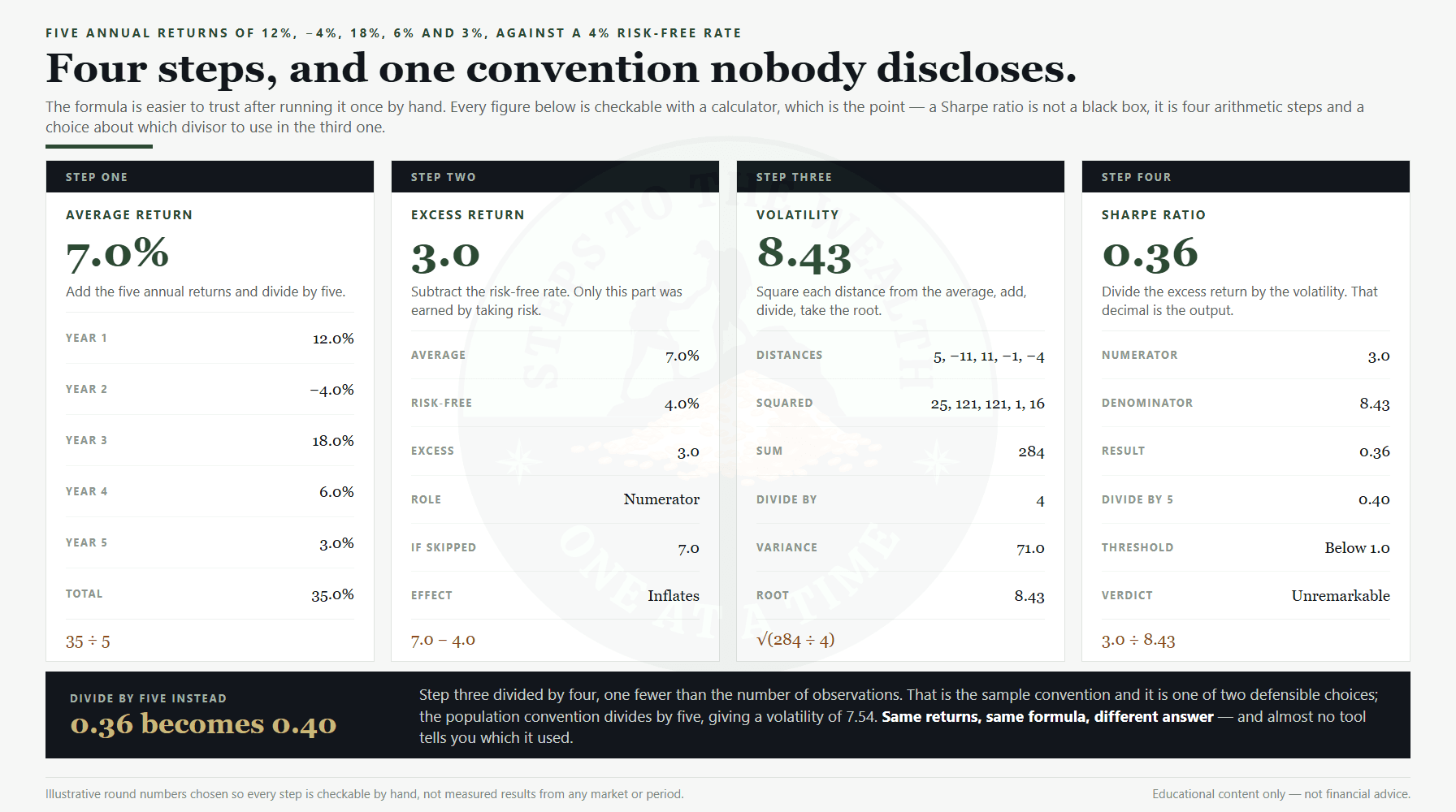
Now notice the divide-by-four. That is the sample convention, and it is one of two defensible choices. Divide by five instead — the population convention — and the volatility becomes 7.54 and the ratio becomes 0.40. Same returns, same risk-free rate, same formula, and the answer moves from 0.36 to 0.40 on a convention almost no tool discloses.
That is a fourth source of divergence on top of the three breakages, and it is the mildest of them. It is included here because it makes the general point concrete: a Sharpe ratio is not one number, it is the output of a series of choices, and comparing two figures from two tools assumes every one of those choices matched.
Why Contribution Plans Need Different Instruments Anyway
Even a perfectly calculated Sharpe ratio is a partial answer for someone running a DCA plan, for a reason that has nothing to do with arithmetic errors.
Volatility in the denominator treats upside and downside movement identically. A month that jumps 6% and a month that falls 6% contribute equally to the number. But those two months are not equally consequential to a person deciding whether to keep contributing, which is the decision a contribution plan actually turns on. The general case for that distinction is made in volatility is not risk.
There is also a horizon mismatch. Sharpe describes the smoothness of a return series. What a long-horizon investor needs to know is the size of the worst hole they would have had to sit in, and how long they sat there — because that, not the standard deviation, is what ends plans.
Three Measures That Answer the Question Better
Maximum drawdown. The largest peak-to-trough fall the plan experienced. It answers the only question that reliably predicts whether someone abandons a strategy: how bad did it get? Replaying a real allocation through real historical crashes is worked through in the portfolio stress test.
Time spent below cost. How many days the plan was worth less than the money put into it. Depth is only half of a drawdown; duration is the half that does the psychological damage, and a shallow decline you sit in for three years is harder to hold than a sharp one that recovers in three months. The recovery arithmetic behind that is in recovering from a big loss.
XIRR. The return measure that accounts for money arriving at different times, which is exactly the situation a contribution plan creates and exactly what a simple annualised return gets wrong. Notably, XIRR handles the contribution problem correctly by construction, which is why it is the right instrument where Breakage Three would otherwise bite. The full comparison is in XIRR versus CAGR. What that number should then be measured against is its own problem, and the way to benchmark your portfolio honestly is worked through separately.
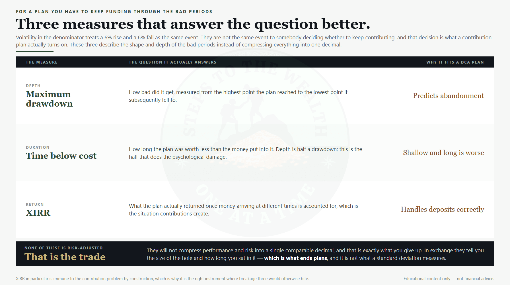
None of these three is risk-adjusted in the way Sharpe is. That is the trade. They tell you about the shape and depth of the bad periods rather than compressing everything into one decimal, and for a plan you have to keep funding through those periods, that is the more actionable information.
The Variant That Fixes the Symmetry Problem
If the objection is that volatility punishes upside and downside equally, there is an established answer: the Sortino ratio.
It keeps the same structure and swaps the denominator. Instead of the standard deviation of all returns, it uses the standard deviation of the negative returns only — the downside deviation. A strategy that occasionally jumps sharply upward is no longer penalised for it, while one that occasionally falls sharply still is.
That is closer to how most people actually experience risk, and for a plan you have to keep funding through bad periods it is arguably the more honest denominator. It carries the same three breakages though: a Sortino ratio computed without a risk-free rate, without annualising, or on contribution-inflated returns is broken in precisely the same ways.
The point is not that one ratio is correct and another is wrong. It is that the denominator encodes a claim about what counts as risk, and you should know which claim you are being handed before you compare the answer to a threshold.
What the Sharpe Ratio Is Genuinely Good For
None of the above makes it a bad measure. It makes it a measure with a job.
It is genuinely useful for comparing strategies or funds with similar mandates over the same period, calculated the same way. That is the comparison it was designed for, and within it the ratio does real work that a return column cannot.
It is also a useful discipline even when you never compute it. Simply asking “what did I endure to get this return” is most of the value, and it is the question that separates a strategy that worked from one that happened to pay off. That framing runs through rules-based investing, and it is the same instinct behind sizing a position from what a decline would cost you rather than from what you hope it returns, as set out in the position sizing rules.
Where it stops being useful is as a single-number verdict on a plan, compared against a threshold, computed by a tool whose formula you have not read.
How To Check a Tool in Two Minutes
You do not need to recompute anything to find out whether a reported figure is trustworthy. Three questions settle it.
- Does it state a risk-free rate? If there is no rate shown and no setting for one, the subtraction is almost certainly not happening, and the figure is running roughly a factor too high.
- Does it say the figure is annualised? If the underlying data is monthly and nothing mentions annualising, you are probably looking at a periodic ratio being compared to annual thresholds.
- Does the plan receive contributions? If it does, and the tool has not documented how it separates deposits from performance, assume it does not. This is the one that most often goes unmentioned.
Two of those you can answer by reading the interface. The third usually requires the documentation, and the absence of documentation is itself an answer.
The Honest Limits
Three caveats on everything above.
The worked figures here are illustrations, not measurements. The 8% return, 12% volatility and 4% risk-free rate are round numbers chosen so the arithmetic is checkable by hand. They are not a claim about any market or period.
A correctly calculated Sharpe ratio is still backward-looking. It describes a return series that already happened, and a high historical figure is not a forecast. Strategies with excellent Sharpe ratios have failed, and some failed precisely because a long run of low volatility concealed a risk that was not being measured.
And no single number, this one included, will tell you whether a plan is right for you. The metric that decides that is the size of the loss you can absorb without abandoning the plan, which is a fact about your circumstances rather than about the strategy. If you want to see how a plan behaved through real market history rather than in a summary statistic, the DCA simulator replays plans against actual price data, and the method for setting one up is in how to backtest a DCA plan.
The point of understanding the formula is not to compute it more often. It is to stop being persuaded by a decimal you have not interrogated.
Educational content only — not financial advice. The figures used above are illustrative round numbers, not measured results, and nothing here is a recommendation to buy or sell any specific asset.