
There is a long list of macro indicators the financial media treats as compulsory. The yield curve. The monthly jobs report. GDP prints. CPI releases. Fed minutes. PMI, consumer sentiment, retail sales. The implication never changes: a serious investor tracks these, interprets them, and positions accordingly.
I track almost none of them. Not because they are hard to understand, but because for a long-horizon investor most macro indicators are some combination of already priced in, too noisy to act on, and not actionable even when they turn out to be right.
That sounds reckless until you ask what any of them actually delivers for someone in my position. Then it starts to look like the opposite of reckless: a refusal to drown a simple, durable process in data that does not change the correct decision.
So let me be precise. Here is the filter I run every headline release through, the short list of structural inputs that survives it, and the single rule that decides which is which.
Educational content only. Not financial advice.
The three filters most macro indicators fail
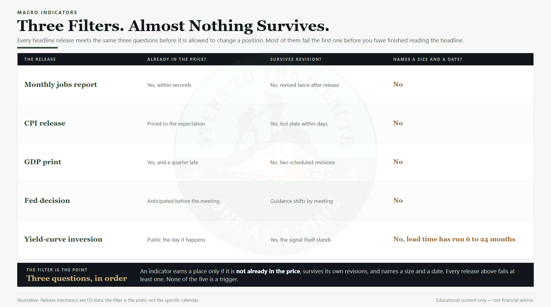
Every popular release fails the retail investor for at least one of three reasons, and usually for more than one. The filter is the useful part, not the verdict on any particular number.
It is already in the price. By the time a jobs report or a CPI release reaches your screen, thousands of professionals with faster feeds and more capital have already traded it. The figure is public. Public information is reflected in the price the moment it lands, and often before, on the expectation. Reacting to the headline an hour later is not acting on information. It is acting on something the market finished absorbing before you opened the tab.
It is too noisy at your timescale. Plenty of headline data gets rewritten after release. The initial payrolls figure is revised twice in the following two months, and GDP goes through its own scheduled estimates before the annual revision touches it again.
That is not a hypothetical. The Bureau of Economic Analysis revision of July 2011 restated the 2007 to 2009 contraction from an average annual rate of 2.8 percent to 3.5 percent, and the cumulative decline over those six quarters from 4.1 percent to 5.1 percent. Two of the worst quarters were rewritten outright: 2008:Q4 from -6.8 percent to -8.9 percent, and 2009:Q1 from -4.9 percent to -6.7 percent. Anyone who sized a decision on the original prints was working from numbers that no longer exist.
It is not actionable even when it is right. This is the one people skip. Suppose an indicator genuinely anticipates a downturn. What exactly do you do? Sell what, by how much, on which date, and with what rule for getting back in? An indicator that is directionally correct but silent on size and timing is not a signal you can use. It is a thing to be anxious about. A single risk reading with an action already attached to it is usable in a way no macro print is, and the rare occasion when that reading is itself distorted has a separate answer of its own.
Run any famous macro indicator through those three filters and watch how little survives. The jobs report is priced in within seconds and revised twice. CPI is priced to the expectation, so the market trades the gap rather than the number. GDP describes a quarter that ended weeks ago. Fed meeting dates are published a year in advance, which means the decision is anticipated and only the nuance is a surprise, and nuance is not something you can size a position around.
Watching is not the same as acting
Underneath the cult of macro data sits an assumption worth stating plainly: that being informed about the economy makes you a better investor. For a long-horizon retail investor it is mostly false, and the gap it hides is enormous.
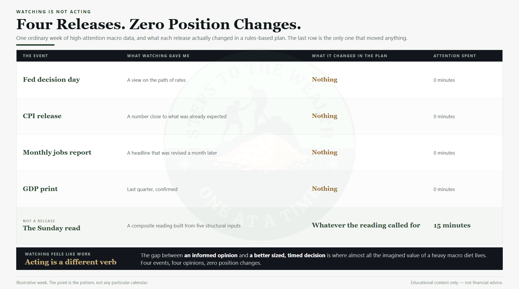
Watching feels like work. You read the release, you form a view, you have something to say when someone asks what you make of the economy. None of that has touched your portfolio. The distance between “I have an informed opinion about the labour market” and “I made a better sized, timed decision because of it” is where almost all of the imagined value lives, which is to say it does not exist.
The watching is also actively harmful, in a specific and measurable way. Every release is an invitation to react, and most reactions are noise. A heavy macro diet does not merely fail to help; it manufactures occasions to break a rule you had already decided was correct. That is the same failure mode as the myths that push people to time their contributions, wearing a more respectable suit.
It matters more than it sounds because attention is the scarce resource here. If you are investing around a full-time job, the hour you spend parsing a payroll print is an hour not spent on the two decisions that actually move your outcome: how much you contribute, and how the money is allocated. The opportunity cost of that time is real even when the reading is free.
The recency trap that makes one indicator feel predictive
There is a reason a handful of indicators acquire near-mystical status. They called one famous crash, the story gets retold, and the retelling does the rest. The yield curve before 2008 is the canonical example.
This is recency bias operating on indicators rather than on assets. The one that worked spectacularly gets weighted as though it works every time, while the false signals, the calls that fired years early, and the stretches where staying invested was obviously correct quietly fall out of the story. The track record in your head is far better than the track record in the data.
The yield curve is the clean case. It has inverted ahead of several recessions. It has also inverted with a lead time so variable that the same signal has been consistent with an imminent downturn and with another two years of gains. Acted on literally, it would have parked you in cash for years at a stretch, and what waiting actually costs is not the drawdown you avoided but the compounding you never started.
Notice who does not make forward calls. The NBER Business Cycle Dating Committee, the body that officially decides when US recessions begin and end, describes its own approach as retrospective and says it “waits until it is confident that a recession has occurred.” The official arbiter of recessions does not attempt to forecast one. It is worth asking why a dashboard on a screen should be held to a lower standard.
The 2020 crash makes the same point from the other direction. The S&P 500 fell 33.9 percent in 33 days, and no macro indicator on anyone’s dashboard produced a timely, sized, actionable warning of it. The recovery to the prior high took 181 days in total. Both the fall and the repair were faster than the data release calendar that was supposedly monitoring them.
The five structural inputs that survive the filter
Ignoring most macro indicators is not the same as flying blind. The process runs on a small set of inputs, and the discipline is in keeping that set small. The distinction that does the work is between a structural input and a headline indicator.
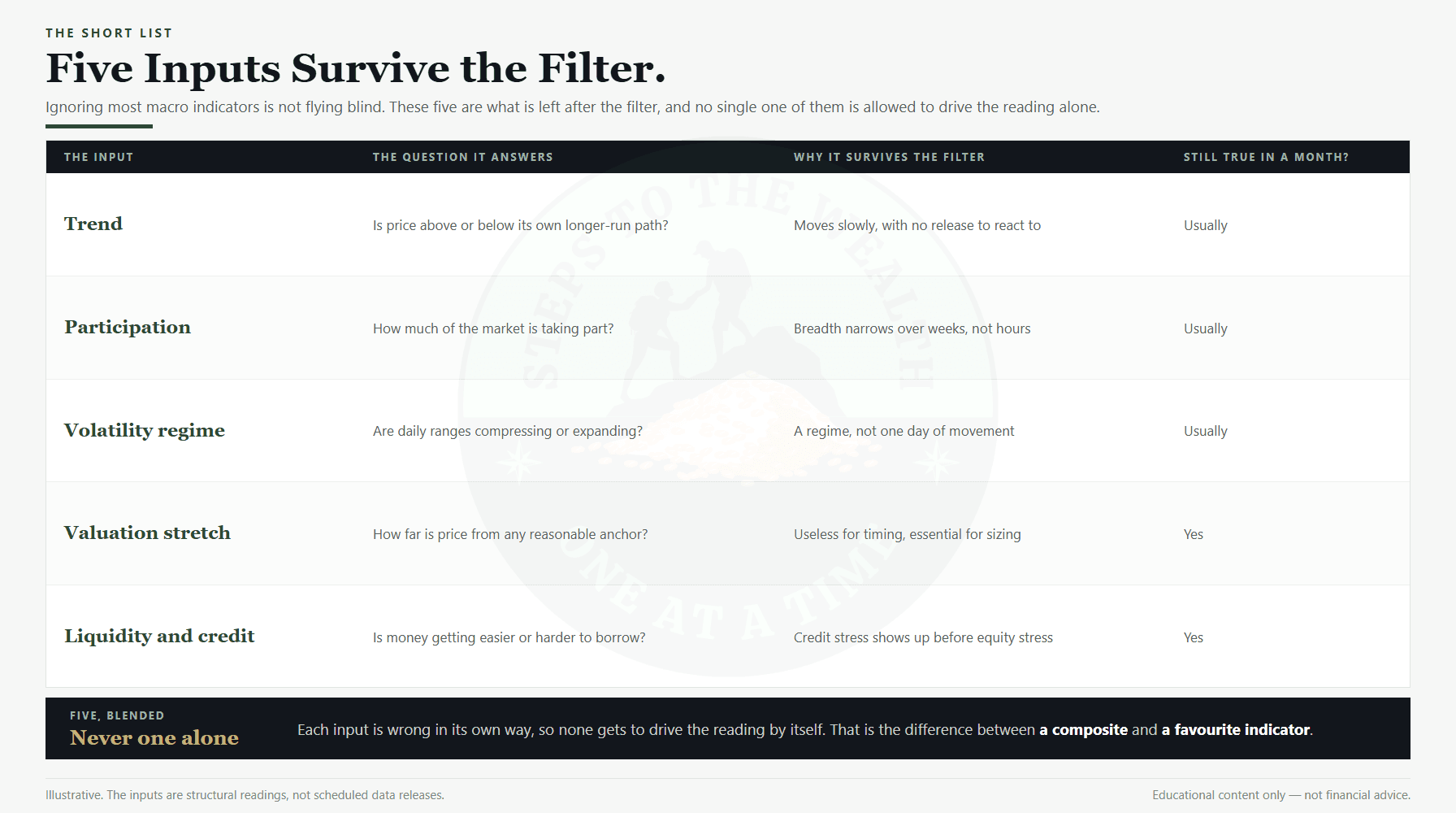
A structural input changes the conditions an asset actually trades under, persists across several readings, and shows up in the underlying signal rather than in one release. It moves slowly, it is hard to fake, and it does not get revised away next month. The test is whether it is still true three weeks later.
Five of them clear that bar. Trend: whether price sits above or below its own longer-run path, and whether that relationship is strengthening or breaking down. Participation: how much of the market is taking part in a move, because a rise carried by a handful of names is structurally weaker than the same rise carried broadly. Volatility regime: not one day’s range but whether ranges are compressing or expanding, since expansion is what turns an ordinary drawdown into a deep one.
Then two more. Valuation stretch: how far price sits from any reasonable anchor, which is useless for timing and essential for sizing, because it tells you what a bad outcome would cost rather than when one arrives. Liquidity and credit conditions: whether money is getting easier or harder to borrow, which tends to show up before equity stress because leveraged holders are forced to act first.
Each one is wrong in its own way, which is exactly why none of them gets to drive the reading alone. Valuation can stay stretched for years. Volatility is largely coincident and tells you the storm has arrived. Trend whipsaws in choppy markets. Blended into a composite, they describe the shape of the risk you are standing in rather than one facet of it, and that composite is what a portfolio stress test then prices in your own currency.
A headline indicator is the opposite: a discrete release that spikes attention and fades. The media organises its calendar around these precisely because they are events, and events generate clicks. In this process they are at most slow-moving components that feed the structural inputs over many weeks. A single CPI print does not move an allocation. A sustained shift in credit conditions eventually does.
The two tests that decide what earns attention
The whole filter collapses into two questions, and both have to be answered yes.
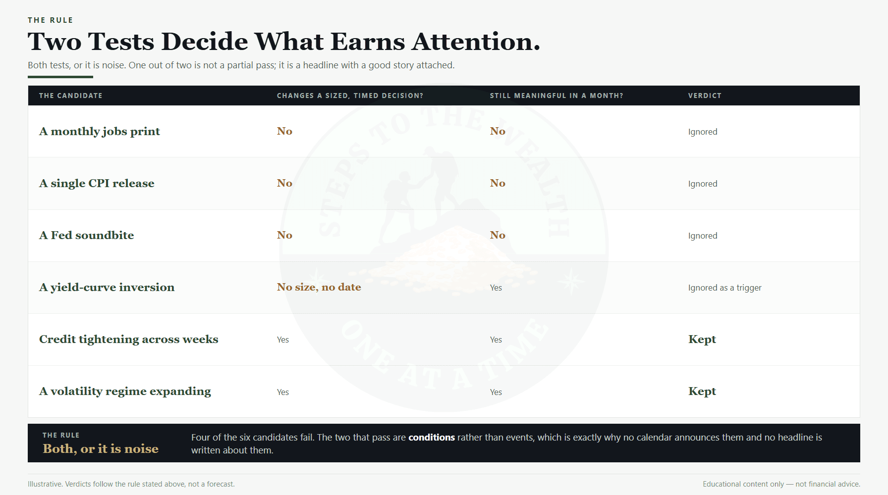
First: does it change a sized, timed decision? Not “is it interesting” and not “does it feel important”, but does it alter how much of what I hold, starting when. Second: is it still meaningful a month from now? A number that is stale in 48 hours cannot be a foundation for a decision measured in years.
Almost no headline indicator passes both. The few structural inputs that do are the entire list, and everything else is filtered out on purpose, because a process that responds to everything responds to nothing well. This is the same principle that makes a risk-first framework workable in the first place: fewer inputs, applied consistently, beat more inputs applied when they happen to feel urgent.
What happens on the days everyone else trades
Concretely: on the days the financial world is glued to a release, I usually do nothing, and the nothing is deliberate rather than lazy.
The weekly cadence handles it. The read happens on its own schedule, not the economic calendar’s. If a release genuinely shifts the structural backdrop, that shift is visible in the inputs at the next weekly read, and if it is real it will still be visible the week after that. If it was noise the market round-tripped within a day, there was nothing to capture and I have saved myself a reactive mistake. Waiting costs nothing and protects against the far more common error.
This feels passive in the moment, particularly when everyone around you is reacting and the move looks significant. But looking significant and being actionable are different properties. Most releases that dominate a week are, a month later, indistinguishable from background noise on the chart. The few that genuinely mattered showed up as a regime change the process would have caught regardless of whether I traded the announcement.
The same logic settles the question people ask about deployment. Waiting for a “better macro backdrop” before investing a lump sum is a timing decision wearing an economics costume, and the lump sum versus dollar-cost-averaging evidence does not reward it. The honest answer to “what do you do on Fed day” is: I run the read on Sunday, like every other week.
What this argument is not
It is not a claim that macro does not matter. It matters enormously. The macro regime is one of the structural inputs, and credit conditions are on the short list precisely because they are macro. The argument is narrower and more useful than “ignore the economy”: most individual macro indicators, consumed as discrete headline events, do not help a long-horizon investor make better sized, timed decisions.
It is not an argument for ignorance either. If you find macroeconomics genuinely interesting, study it. Just do not confuse studying it with improving your portfolio. They are separate activities, and conflating them is one of the quietly expensive beliefs in personal investing: that more information must mean better decisions. Past a small, well-chosen set of structural inputs, more information mostly means more noise and more chances to break your own rules.
And it is not a claim that the framework is never wrong. Structural inputs can be distorted too. The 2008 to 2009 crisis is the standing reminder that conditions can deteriorate faster than any weekly cadence is comfortable with, which is an argument for sizing that survives being wrong, not for watching more screens.
Common questions about macro indicators
Which macro indicators actually matter for a long-term investor?
As standalone triggers, almost none. What matters is a small set of structural conditions read as a blend: trend, participation, volatility regime, valuation stretch, and liquidity and credit. Those change how much risk is worth carrying. A single data release, on its own, does not.
Does the inverted yield curve predict recessions?
It has preceded several, and the relationship is real but wildly imprecise on timing. The lead time has run from months to roughly two years, which is exactly what makes it unusable as a trigger. A signal that cannot tell you when, how much, or for how long is not a decision rule. Note that the NBER, which dates US recessions officially, works retrospectively and does not forecast them at all.
Should I stop reading financial news entirely?
Not necessarily, but be honest about which activity you are doing. Reading for interest is fine. Reading in order to decide is where the damage happens, because each release becomes an occasion to override a rule that was correct when you set it. If you cannot read without reacting, reading less is the cheaper fix.
What about inflation, is that not different?
Inflation as a sustained regime absolutely matters, and it feeds valuation and credit conditions over many months. A single CPI print is a different object entirely. The market has already priced the expectation, so the release is traded on the gap rather than the level, and the gap is not something a long-horizon investor can size a position around.
The short version
Most macro indicators are already priced in by the time you read them, too noisy at the timescale that matters to you, or not actionable even when they are directionally right. Watching them feels like diligence and functions like overtrading.
What survives the filter is short: five slow-moving structural inputs, read weekly and blended, that change a sized decision and are still meaningful a month later. Everything else, including the famous indicator that called one crash and is remembered for nothing since, gets ignored on purpose.
Ignoring the indicators everyone watches is not flying blind. It is refusing to drown a durable process in data that does not change the right move. The discipline is not in knowing more. It is in knowing which few things matter and having the nerve to ignore the rest.
Read less. Track less. Decide better.
Educational content only. Not financial advice. Which inputs are relevant to your situation varies by circumstance, and no framework removes the risk of loss. Historical figures cited here are worked examples of past market behaviour, not forecasts. Work with a qualified financial professional before acting on any of this.